Web accessibility - 5 common mistakes to avoid to create inclusive sites
- Camilla Mercadante

- Dec 27, 2025
- 4 min read

INTRODUCTION TO WEB ACCESSIBILITY: 5 COMMON MISTAKES TO AVOID TO CREATE INCLUSIVE SITES
Society spends more and more time online, but not everyone can access online content with the same ease. In fact, people with disabilities often encounter obstacles that others don't even notice when visiting a website. These obstacles can make it difficult to read text, watch videos, fill out forms, or interact with buttons and links. Making a website accessible means breaking down barriers and allowing everyone to navigate freely, without the frustration of feeling excluded.
In this article, we'll explore the five most common mistakes in creating accessible websites and offer practical tips for avoiding them.
WHY ACCESSIBILITY MAKES THE DIFFERENCE
For many people, visiting a website isn't as easy as it might seem. Those with disabilities often face invisible obstacles that become real challenges.
Consider Luca, blind since birth, who uses a screen reader. On many websites without alternative descriptions for images, he can't understand the visual content. Or Giulia, who is deaf: without subtitles in videos, she misses important information and feels excluded from conversations. Marco, a wheelchair user, may have trouble filling out forms or clicking buttons if they aren't designed for reduced mobility.
Yet, certain small adjustments could improve the quality of our browsing experience. It's not just a matter of convenience; it's about giving every user the opportunity to learn and fully participate in digital life.
FIVE MISTAKES TO AVOID FOR AN INCLUSION-PROOF SITE
According to the WebAIM Million 2025 report , a study that analyzed the homepages of the million most visited websites for automatically detectable accessibility errors, 94.8% of them showed at least one error, with an average of over 51.4 issues per page—a total of approximately 50 million issues found. These numbers demonstrate that most websites continue to exclude, albeit unintentionally, countless people with disabilities.
Here are the five most common mistakes and how to avoid them:
Lack of alternative text for images: Without text descriptions, screen reader users can't see the visual content. Always include descriptive and effective "alt text" to convey that message in text or voice.
Insufficient contrast between text and background: Gray text on a light background, for example, is nearly invisible to visually impaired users. The Web Content Accessibility Guidelines establish minimum text-to-background ratios: for level AA (recommended), normal text should have a contrast of at least 4.5:1, while large text should have a contrast of 3:1. For level AAA (highest), normal text should have a contrast of 7:1 and large text should have a contrast of 4.5:1. These values ensure that content remains legible even for those with low vision or color blindness.
Videos without subtitles or transcripts: Those with poor hearing risk missing information. Adding accurate subtitles or a transcript not only helps deaf people, but also helps those watching videos in a foreign language or in a noisy environment.
Keyboard-incompatible navigation: Many people don't use a mouse. If links and buttons aren't keyboard-accessible, the site becomes unusable. Creating interfaces that can also be navigated using the arrow keys and space bar gives everyone the opportunity to orient themselves like all other users.
Complicated or improperly labeled forms: Unlabeled fields or fields with unclear instructions create enormous inconvenience. Using simple, visible labels with understandable error messages gives fillers the feeling of being guided step-by-step, without hesitation. Well-structured fields thus become an invitation to continue, rather than a discouraging obstacle.
Addressing mistakes doesn't mean revolutionizing design, but applying good practices that make the web a truly welcoming world for everyone.
PRACTICAL TIPS
Always check color contrast before publishing. A free and reliable tool for this is available here: WebAIM Contrast Checker ;
Add subtitles to all videos, even short ones;
Use automated testing tools and involve users with disabilities when creating or editing your site;
Add a text-to-speech engine that reads pages aloud to those who need it.
GLOSSARY
Web Content Accessibility Guidelines : International Guidelines for the Accessibility of Web Content;
Arrow keys: Keyboard arrows (up, down, left, right) used to navigate links, menus, and buttons without a mouse;
Screen reader: software that reads the contents of a page aloud (in Italian “screen reader” );
Alt text: Alternative text that describes images for those who cannot see them.
A LOOK BEYOND THE SCREEN
Looking beyond the lines of code and graphic layouts is the wisest choice a programmer can make, as it raises important and – unfortunately – far from obvious questions: who is left out when we don't build inclusive spaces? How many voices do we risk not hearing, how many gazes not meeting?
The web isn't just a collection of pages: it's a community of people. Making a site accessible allows more individuals to contribute their ideas to the community and feel part of a global dialogue. It's a gesture of responsibility, but also an act of faith: the faith that, one day, a more just digital world can foster an equally equitable real world.
Technologies evolve, and with them the ways we communicate. But a question remains: do we want a network that divides or a network that unites? Every design choice, every written word, and every added feature has the power to answer this question.
Ultimately, accessibility is an invitation.
CONCLUSION
The web can be a bridge or a wall. It's up to us to decide what to build.
We don't need revolutions, but simply attention, care, and awareness. An alternative text, a readable contrast, a clear form... these are small gestures that have a huge impact on people's lives.
Imagine an internet where no one is left behind, where every voice is heard. This future is not far away: it starts with what we do today, with our websites, content, and design.
We invite you to share the article, tell your experience in the comments and join those who believe that accessibility is not a favor, but a right.
SOURCES
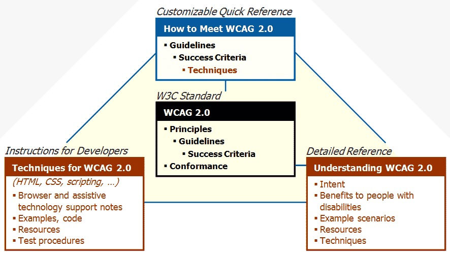
Image source: W3C Web Accessibility Initiative (WAI)


Hello Camilla, you did an amazing job with this article. Good job!
Really interesting, I don't know these guidelines, thank you Camilla
Thanks for the tips